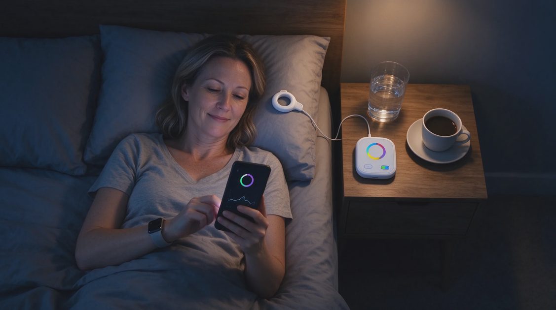
Modern wearables arrive packed with scores, stages, rings, batteries, readiness numbers, temperature variations, blood-oxygen estimates, and endless secondary charts. The marketing implies that more data equals better health decisions. In daily life the opposite often proves true. The more features you try to monitor, the more opportunities appear for conflicting signals, unexpected dips, and the low-grade sense that you are still not paying enough attention.
I spent years studying how people actually used these devices. The pattern was consistent: the features that changed behavior for the better were almost always the simplest ones. The elaborate dashboards that looked impressive in product demos rarely survived contact with ordinary mornings, full jobs, and family logistics. Most people ended up either overwhelmed or quietly ignoring most of what the device offered while still feeling vaguely responsible for all of it.
The practical skill is not learning every feature. The practical skill is deciding which small set of features deserves ongoing attention and which ones can be turned off, hidden, or simply never opened. That decision restores a sense of proportion. The device returns to being a tool instead of a comprehensive supervisor.
Start by Naming the Decisions You Are Willing to Make
Features only earn their place if they regularly inform an action you are prepared to take.
List the adjustments you have actually made in the past three months
Think back. Did a sleep number lead you to protect an earlier bedtime on a few nights? Did a step count remind you to take a short walk on sedentary days? Did a recovery estimate help you choose a lighter workout when you already felt depleted? Write down only the changes that occurred. These are the proof points. Features that never produced a corresponding action are candidates for removal.
Notice which numbers create emotion without action
Some metrics reliably shift your mood—disappointment, mild pride, anxiety—yet never lead to a concrete adjustment. That emotional charge without behavioral payoff is a clear signal that the feature is costing more than it gives. Those numbers can usually be hidden without any loss of useful information.
Accept that most features will not clear the bar
A typical wearable offers dozens of data points. Most adults need three to five at most. The rest exist because product teams can measure them and because comprehensive dashboards photograph well. You are under no obligation to use everything that can be displayed. Choosing a short list is not a failure of diligence. It is a success of prioritization.
Features That Commonly Earn Their Place
Certain measurements show up again and again as genuinely helpful for ordinary adults when they are used lightly.
Total sleep time and rough consistency
Knowing whether you are generally getting enough hours and whether your sleep timing is relatively stable across the week is useful for many people. These numbers are among the more reliable estimates consumer devices produce. They support simple decisions: protecting bedtime on heavy weeks, noticing when late nights are clustering, or recognizing that a stretch of short sleep matches low daytime energy. Detailed stage percentages add far more uncertainty than insight for most users.
A basic activity or movement volume
A daily or weekly step count, active-minute total, or similar volume metric can serve as a gentle reminder on sedentary days. The value lies in the broad pattern, not in hitting an exact target every twenty-four hours. When the number is treated as a soft prompt rather than a daily grade, it tends to support movement without creating performance pressure.
Resting heart rate or a simple recovery estimate—if it matches lived experience
For some people a resting-heart-rate trend or a basic recovery score correlates reasonably well with how they feel. When that correlation is present, the number can help confirm a decision to rest or to proceed. When the correlation is weak or contradictory, the same number becomes noise. The only way to know is to compare the metric against your own energy for a few weeks and then decide.
Features That Rarely Deserve Daily Attention
Many popular metrics create more evaluation than guidance.
Granular sleep-stage breakdowns
Consumer devices estimate stages from movement and pulse. The estimates carry meaningful error margins. Watching deep-sleep or REM percentages fluctuate night to night often produces anxiety without producing better sleep. Most people sleep better when they protect total time and consistent timing rather than when they chase stage targets the sensor cannot accurately measure.
Continuous secondary scores and body-battery style metrics
These composite numbers attempt to summarize recovery, stress, or remaining capacity. They can occasionally highlight a multi-day trend. Checked daily they frequently generate conflicting or overly precise signals that the underlying data cannot support. Many users find that turning them off reduces mental overhead with no loss of practical insight.
Blood-oxygen, temperature variation, and similar advanced estimates
These features can be interesting in specific contexts and may eventually prove more useful as the technology improves. For everyday decision-making they currently add complexity without clear actionability for most healthy adults. Unless a clinician has specifically asked you to monitor one of them, they can usually remain in the background.

How to Implement a Shorter Feature List
Once you have decided what deserves attention, make the decision visible in the device itself.
Hide or disable everything that did not make the cut
Most apps allow you to customize the dashboard or turn off individual metrics. Use those settings aggressively. A cleaner home screen reduces the temptation to monitor numbers you have already judged unnecessary. The less you see, the less emotional energy the unused features can claim.
Set a review rhythm that matches the feature’s actual value
Total sleep time may be worth a brief daily glance. Activity volume may work best as a weekly total. Recovery trends may need only a Sunday look. Matching the frequency of attention to the frequency of useful decisions keeps the data from becoming compulsive background noise.
Revisit the list every few months
Life changes. A feature that was useful during a high-stress season may become irrelevant later. A metric you ignored may later prove helpful. A short quarterly check—does this still inform decisions I am willing to make?—keeps the set current without requiring constant re-evaluation.
The goal is not to extract every possible data point from the device on your wrist. The goal is to keep the small number of features that reliably support the life you are actually living and to release the rest. More measurement does not automatically produce better decisions. Clearer prioritization does. Choose the features that have already proven their usefulness in your own days. Let the rest stay quiet. Let the data inform you, not run you. Your attention is limited. It deserves to be spent on the measurements that earn their place.



Letters
No letters yet — be the first to write.